Categories for Strategy

Let your community grow alongside you: Ship unfinished apps.


[editors note: This was a guest post written by: King Sidharth. King Sidharth is a young entrepreneur and designer. He works at Besperk while helping startups any way he can find. You can read more of his stuff at 64 Notes or say hi: king@kingsidharth.com]

Do you remember Google Wave? It was a social app that shipped in (nearly) complete form. It had all sorts of bells and whistles. It also was very confusing and much of the UI focused on solving problems that real life users weren’t experiencing. After a year or so Google canned the project for lack of user adoption.

Contrast that with Gmail. Gmail started as a barebones application that slowly grew with the communities needs. Take, for example, Priority Inbox. Priority Inbox came from users complaining that they were overwhelmed with emails. Features that grow organically from user requests make much more sense then features added because of a board meeting.

Another example of an application that grew with the community is Twitter. When Twitter first launched it was extremely simplistic. Users complained that there wasn’t a way to reply to users, so they started to use the “@” symbol to signify a response to a specific person. Twitter then adopted this practice for their official clients and made it a feature.

It’s not about adding every feature users ask for, it’s about solving problems, creating a better experience, and improving the little things. This is why the concept of MVP works so well. MVP allows you to ship the bare minimum and find out where the users pain points are located.

You cannot build a social startup in the dark corners of your room.

You need to ship it- raw, unfinished, and let your users have a taste. Then key in on finding their problems and fix them quickly.

Sitting in a dark room developing your social startup alone (or worse – having someone else work on every aspect of it while you’re the idea guy) makes it so easy to say, “add this – they might need it.” Doing that will keep you a step removed from your actual users.

Startups, like poetry, are never finished. They are always being abandoned or always growing.
For more startup news, follow us on Twitter @startupfoundry.

Teaching developers UX: Use Fitts’ law to build a polished landing page


I’ve had several technical founders ask for advice on building landing pages. Typically it’s bootstrapped companies that want to increase conversion rates, but don’t have the capital to hire a UX designer. In this series of articles I’m going to identifiy a common problem I see, and how to fix it. Today I’m going to give you a brief overview of Fitts’ law and how developers can improve their UX.

What is Fitts’ Law?

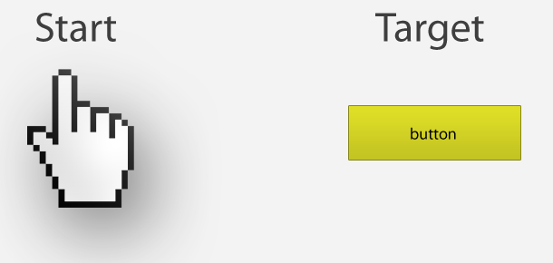
Fitts’ law can be described in the mathematical formula to the left. T is time. a is the intercept and b is the slope. D is the distance to the center of the target. W is the width along the axis of motion.
Essentially Fitts’ law describes how long it takes you to point to an object. This is a pretty basic concept, but the mathematical formula gives us a framework to know exactly how to build things. Since we are looking at this through a landing page lens, the objects I will be focusing on will be buttons and links.

How should we design buttons and links?

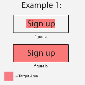
1. Buttons and links are some of the most important elements on your landing page. You can improve the UX by increasing the target size. A common mistake I see is developers often build their buttons were only the text is clickable (see figure a). The rest of the button is just used for eye candy and is non interactive. By changing the whole button to a clickable state (see figure b), you will dramatically lower the amount of time a user spends trying to click. A good UX will minimize pain points, no matter how small.
2. The next thing that we can do to improve our UX is to increase target size. The basic premise is big buttons are easier to click. For example, it’s much easier to point at a car then it is to a key.

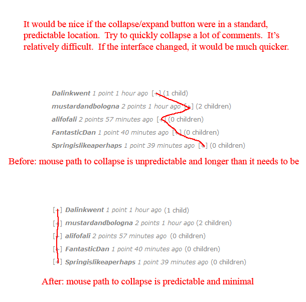
3. The last common button placement issue I see is with button placement. Take this example from Reddit user jbu311 .

Keep Fitts’ law in mind when you’re designing your landing pages to increase conversions. It’s amazing how small tweaks can minimize the amount of friction users encounter.

For more startup news, please follow us on twitter @startupfoundry.

Startup Riot’s Sanjay Parekh on “How to Put Together a Slide Deck”

Sanjay Parekh has a lot of experience with startup pitches. Sanjay runs Startup Riot where, once a year, 50 companies pitch their deck in a single day. He has seen the whole gamut of pitches from fantastic, to horrible, to captivating. He recently Skyped in to share with TSF readers some basic tips on how to improve your own pitch. Don’t miss this 8 minute video!

This is part 2 of our interview with Sanjay. Be sure to check out part 1, “I pitched 200 VCs in 10 months before I closed the round”.

Highlights:

1. Don’t skip the “why” of your startup. Assume the crowd knows nothing about your startup.

2. Keep it simple. Text is fine for a document, not a PowerPoint.

3. You want to emotionally connect with the audience.

4. If you see a lot of text on a slide. Your attention shifts to the text instead of the presenter.

5. The point of the slide is to convey information and augment what the speaker is talking about

6. The ideal slide that complements what you’re saying (instead of speaking for you) would have a lot of visuals, but wouldn’t describe . That’s your job.

7. Create an outline before you fire up PowerPoint or Keynote. Know what direction you’re headed in before you start creating.

8. People connect with stories, not facts and figures. Focus on your narrative.

9. Adjust the deck to the audience.

For more startup news, please follow us on Twitter @startupfoundry.

Why entrepreneurs and founders often have trouble sleeping: Closure.

When I’m physically exhausted and craving sleep I close my eyes and I see code. Methods and variables gleefully dance on the inside of my eyelids and new ideas pulse through my veins. My brain doesn’t care it has spent the last 12 hours focused on my startup, it wants more. It’s addicted.

Last night was no different. After an hour of unsuccessful negotiation with my body to go to sleep, I admitted defeat and jumped on the computer and worked so I could get my fix. After several hours, I decided to send out a quick tweet to see who else was hacking away at 3:30 am. An outpouring of entrepreneurs began to flood my Twitter timeline.

It appears I am not alone.

Background:

I never had this problem when I was working a 9-5 job. My sleeping problems began when I started working full time on my startup. I’ve tried changing my diet, exercising more (I’m already pretty active), and Ambien without having much success sleeping.

My Diagnosis:

After talking with several other entrepreneurs (and my own personal experience), I believe that founders often have trouble getting closure in a work day. For most people working a corporate 9-5 job, they can checkout the second the clock strikes 5 and have little trouble leaving their “work at work” (not always true, but I’m speaking in generalities).

Entrepreneurs aren’t afforded that luxury. An entrepreneur has his fingerprints all over the company and the startup often reflects much of the founders personality. I’ve found that so much of myself is wrapped up in my business that it can be hard to mentally check out at the end of the day.

It doesn’t help that I had an arbitrary goal of “making it big” without any clear definition of what that actually meant.

My Solution:

Figure out your end goal. If you could snap your fingers and give your startup success, what would that look like? After you have this big picture view of your company, break down your success into steps you can take. Then start a checklist of things you must get done each day to move you forward. Doing this helps you get “closure for the day” by reminding you that you’re actually making progress.

Remember, you are a separate entity from your startup.

If you have any other advice, I’d love to hear it in the comments. I don’t have this issue completely figured out, and I would appreciate additional insight.

Please follow us on Twitter @startupfoundry.

The audacity of charging from day one.


“We will start charging in version 2.” As the entrepreneur wishfully daydreamed he tacked on “Perhaps not till version 3. Or maybe 4”. I asked the entrepreneur if his product was buggy, and he said “No, it just doesn’t have all the features we have planned yet”.

His answer baffled me. They had a stable, secure product that did a few things very well. Their app didn’t have feature X,Y, and Z (like their competition did), but they had a superior workflow that saved small business owners a lot of time.

After further prodding I discovered they had a user base of over 1,000 business, many of their customers were practically begging to pay for premium access, and yet the startup was running out of money. “Charge for it”, I replied. “Your customers obviously like what you’re doing and you’ve clearly demonstrated value”. His face conjured an expression equally split between disgust and contempt. He felt that by charging for his product he would be a “sell-out” in the startup community.

Why is there apprehension about making money in startup land?

Is it possible that quite a few entrepreneurs simply aren’t interested in making money? Perhaps they are more intoxicated with the process of building a startup then ringing the cash register. Entrepreneurship is about more then just money, but money is a necessary to keep the lights on.

Don’t be ashamed to charge money for a product or service that has value. If your community tries to shame you for this, ignore them.

Old is the New new

Earlier today I asked, “Has anyone successfully bootstrapped their company by charging from day one?” I received several responses, and my favorite reply came via email from Peldi Guilizzoni (Founder of Balsamiq) “Ehm, because that’s how the world has worked since the invention of commerce? I give you something of value, you give me money in exchange. Why is that audacious?”

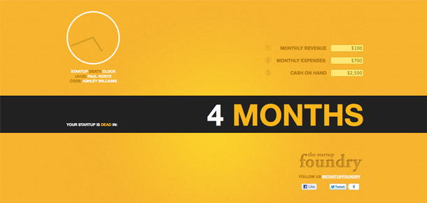
Go build something of value and charge for it. If you need some inspiration, checkout The Startup Death Clock.

For more startup news, please follow us on Twitter @startupfoundry.

Polishing your pitch: Don’t try to be everything to everyone.

Last week I met an entrepreneur who asked if he could talk to me about his startup. I said “yes,” and he began his pitch. He had an interesting concept, fantastic tech, and he was already funded. As I pulled out my iPhone to jot down some notes, I asked him a simple marketing question, “Who did you build this for?”

I saw panic race across his face and beads of sweat began to form on his forehead. His answers were all over the spectrum. Answers ranged from soccer moms, to kids doing homework, to professional videographers in Hollywood. Essentially he gave me a shotgun pitch when I was looking for a laser.

Upon reflecting on his pitch, I believe he was trying to prove that there was a market for his startup. All of his additional use-case scenarios just added noise to his pitch and watered down the impact of his presentation.

The most important thing when you’re pitching your startup, is to build a clean, concise narrative. Focus on one demographic and demonstrate your startup’s immense value to that user group. Work on getting traction with one market before you try to expand.

It’s impossible to be everything to everyone and it distracts from the important parts of your pitch.

For more startup news, follow us on Twitter @startupfoundry.

3 lessons startups can learn from the infamous Gizmodo redesign

Gizmodo shipped their boldly redesigned home page February 7 amidst a sea of controversy. The redesign was almost universally panned by it’s readers and traffic dropped significantly. I decided to dissect Gizmodo’s redesign and distill three lessons entrepreneurs could learn from their mistakes.

1. Communicate clearly to your users

To understand how you were suppose to use the new site, Gizmodo put up a tutorial. If you must explain how to use a news website, you’ve probably blown it. The infamous Gizmodo redesign happened when designers and coders became more interested in HTML then communication.

When you’re building the UI and UX of your app, make it as simple as possible.

2. Multiple small frequent iterations are better then one massive change

Gawker Media (Gizmodo’s parent company) shipped their CMS with glaring bugs. Many users reported that pages weren’t loading, the scrollbars weren’t scrolling, and the site was completely useless without javascript. They could have very easily broken up the redesign into several minor improvements and rolled them out one by one.

It’s better to have fewer features that are ultra-polished then a big bag of crap.

3. Treat your users with respect

I stopped reading Gizmodo when they started to cover up their main stories with slide-down dynamic ads. You had to wait 5-10 seconds to even read the title of the first story to see if you were interested in reading it.

As Paul Graham said “Users are hovering over the back button [of their browsers]”. Don’t give your users a reason to leave your site immediately by disrespecting them with obnoxious advertisements.

For more startup news, please follow us on Twitter @startupfoundry.

You’re not entitled to anything. Hustle for everything you’re worth

I’ve received some very angry emails from founders that are trying to get their startup featured on TSF. For example:

“I submitted our startup yesterday, and you still haven’t written about us yet on The Startup Foundry! What gives? Is you head so far up your ass you can’t see how great our app is? You guys are exactly like TechCrunch!”

Typically I delete the email and setup a filter to automatically avoid any future contact with the person, but this time I felt compelled to respond to the founder (Perhaps it was the TechCrunch barb that pushed me over the edge) in public. I’m not going to write about his startup but I do want to share some universal advice with him.

You’re not entitled to anything. You must hustle for everything you’re worth.

The best way to get your startup covered is to have an awesome narrative, not a sense of entitlement. Writers are salivating to spread great stories about awesome startups. After all, everyone loves to root for the underdog.

Airbnb has one of my favorite hustling stories ever from a team of relatively “unknowns”.


The Airbnb founders came out of the summer 2008 Y Combinator class. They came to see us right after pulling a great stunt at the Democratic Convention in Denver (in which Obama was nominated). They bought a bulk supply of generic cheerios and made up these cereal boxes. They sold these Obama Os for $4 a box and sold 8,000 of them, raising $32,000 to provide seed capital for their startup. I asked them if they’d leave a box of the cereal for us and it has been sitting in our conference room ever since. Whenever someone tells me that they can’t figure out how to raise the first $25,000 they need to get their company started I stand up, walk over to the cereal box, and tell this story. It is a story of pure unadulterated hustle. And I love it.

Fred Wilson on AirBnB

How could you even begin to doubt these guys determination? Sure the story is a little bit silly, but the Airbnb people are the type of people you can’t help but write about. I’ve also put together an article covering 5 ways to make your startup ridiculously easy to write about to get you started. I hope you check it out.

Build a great company, be kind, and hustle. These are the things you need to move forward.

I wish you the best,
Paul Hontz

For more startup news and advice, please follow us on Twitter @startupfoundry.