Welcome to The Startup Foundry.
Teaching developers UX: Use Fitts’ law to build a polished landing page
Paul Hontz
TSFPublished: Apr 5, 2011 5:14 pm
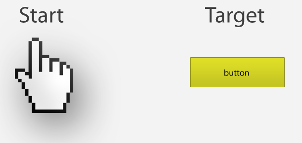
I’ve had several technical founders ask for advice on building landing pages. Typically it’s bootstrapped companies that want to increase conversion rates, but don’t have the capital to hire a UX designer. In this series of articles I’m going to identifiy a common problem I see, and how to fix it. Today I’m going to give you a brief overview of Fitts’ law and how developers can improve their UX.
What is Fitts’ Law?
 Fitts’ law can be described in the mathematical formula to the left. T is time. a is the intercept and b is the slope. D is the distance to the center of the target. W is the width along the axis of motion.
Essentially Fitts’ law describes how long it takes you to point to an object. This is a pretty basic concept, but the mathematical formula gives us a framework to know exactly how to build things. Since we are looking at this through a landing page lens, the objects I will be focusing on will be buttons and links.
How should we design buttons and links?
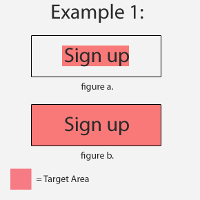 1. Buttons and links are some of the most important elements on your landing page. You can improve the UX by increasing the target size. A common mistake I see is developers often build their buttons were only the text is clickable (see figure a). The rest of the button is just used for eye candy and is non interactive. By changing the whole button to a clickable state (see figure b), you will dramatically lower the amount of time a user spends trying to click. A good UX will minimize pain points, no matter how small.
2. The next thing that we can do to improve our UX is to increase target size. The basic premise is big buttons are easier to click. For example, it’s much easier to point at a car then it is to a key.
3. The last common button placement issue I see is with button placement. Take this example from Reddit user jbu311 . 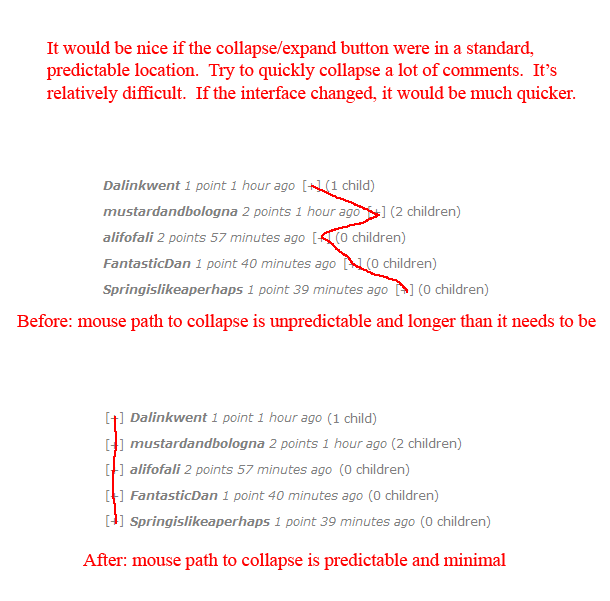
Keep Fitts’ law in mind when you’re designing your landing pages to increase conversions. It’s amazing how small tweaks can minimize the amount of friction users encounter.
For more startup news, please follow us on twitter @startupfoundry.
-
👉 Filed Under.
Categorised in: Strategy
Get Connected:
If you like startups, join our weekly mailing list. Good startup content, no fluff.
👇

Hi, I'm Paul Hontz.
I'm a YC alumn and I love startups. I created TSF to highlight companies I find interesting. You can learn more about me here.
Recent Posts:

The Story of Cruise (YC W14): How 4 people built a self driving car in 7 months.
Jul 8, 2014 2:35 pm

I Want To Write About Your Startup – Relaunching TSF
Jan 17, 2014 5:14 pm

How To Do B2B Email Sales
Nov 23, 2011 2:12 pm

Nasty Bug in iOS 5.0.1 OTA Update screws up Address Book on the iPhone 4S
Nov 10, 2011 11:56 pm

It’s Easier to Answer to Your Code Than Your Customers
Oct 28, 2011 2:25 pm


